A navigation menu is the map of your site. Visitors use it to answer "where am I?" and "where can I go next?" in seconds. If the menu is cluttered, hard to tap on a phone, or missing the pages people need, they leave — even when the rest of the design is strong.
This guide covers modern CSS navigation patterns for business sites, portfolios, SaaS pages and small shops. You get structure advice, accessibility notes, and copy-paste HTML, CSS and small JavaScript snippets. Prefer clicking around first? Open the live playground: /demo/css-navigation-menus/.
What CSS navigation menus are
CSS navigation menus are lists of links arranged with CSS so users can move between pages, sections, products and actions. The classic place is the header, but navigation also lives in sidebars, footers, mobile bottom bars, breadcrumbs, tabs and filters.
Modern CSS covers most of the layout and polish: Flexbox, Grid, position: sticky, media queries, custom properties, transitions and :focus-visible. Use a little JavaScript when you need open/close state, ARIA attributes, or "click outside to close".
- Responsive navbars for desktop and mobile
- Sticky headers that stay available while scrolling
- Dropdowns and multi-level menus for grouped pages
- Mega menus for large catalogues and product lines
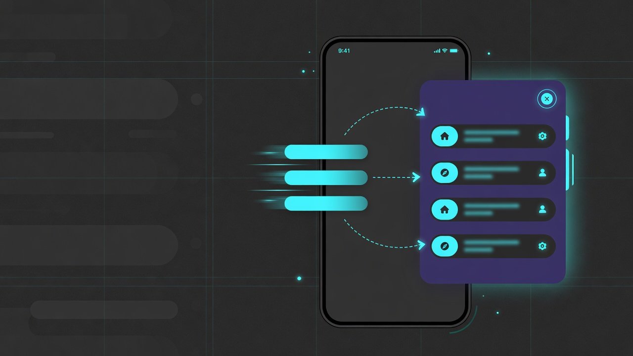
- Hamburger, overlay and slide-in drawers for phones
- Sidebars for dashboards and documentation
- Tabs, pills, breadcrumbs and footer link columns
Why navigation still matters in 2026
Phones dominate traffic, but desktop users still expect hover-friendly dropdowns and wide mega menus. A good system adapts: clear labels, touch-friendly targets, obvious open/close behaviour, and a path to the primary conversion (book, buy, contact, start free trial).
- UX: people find pricing, services and contact without hunting
- Mobile: 44px+ tap targets, simple panels, easy dismiss
- SEO: sensible internal links help crawlers map the site
- Trust: a clean header reads as professional
- Conversion: the CTA stays visible without screaming
CSS-only vs JavaScript menus
| Pattern | CSS-only | JS recommended |
|---|---|---|
| Simple navbar / underline / pills | Yes | No |
| Desktop dropdown / mega (hover) | Often yes | For keyboard + click-toggle |
| Mobile hamburger / overlay / drawer | Possible with checkbox hacks | Yes — clearer ARIA and focus |
| Collapsible sidebar | Limited | Yes |
Rule of thumb: CSS for layout and look, JS for state. Keep scripts small and toggle a single class (for example .is-open) on a parent element.
Responsive principles that actually help
- Clear labels — "Services", "Pricing", "Contact" beat clever nonsense
- Prioritise — not every page belongs in the top bar
- Touch spacing — about 44x44px hit areas on mobile
- Hover + focus + active — keyboard users must see focus rings
- Do not trap people — mobile menus need an obvious close control
- Avoid mega-headers — if everything is primary, nothing is
Design navigation as a system: logo, primary links, optional groups, one primary CTA, and a mobile strategy that reuses the same content — not a second, conflicting menu.
Practical examples
Each example is self-contained. Prefix class names if you paste several into one stylesheet. Colours use a dark slate + cyan accent palette — swap to your brand tokens. Live versions of several patterns are on the demo page.
1. Responsive navbar with hamburger
The default pattern for marketing sites: horizontal links on desktop, toggle panel on small screens.
HTML
<header class="nav-r">
  <a class="nav-r__logo" href="/">Studio</a>
  <button class="nav-r__toggle" type="button"
    aria-expanded="false" aria-controls="main-nav" aria-label="Open menu">
    <span></span><span></span><span></span>
  </button>
  <nav id="main-nav" class="nav-r__menu" aria-label="Main">
    <a href="/">Home</a>
    <a href="/services/">Services</a>
    <a href="/work/">Work</a>
    <a href="/pricing/">Pricing</a>
    <a href="/contact/">Contact</a>
    <a class="nav-r__cta" href="/contact/">Get started</a>
  </nav>
</header>
CSS
.nav-r {
  display: flex;
  align-items: center;
  justify-content: space-between;
  gap: 1rem;
  padding: 1rem 1.25rem;
  background: rgba(15, 23, 42, 0.9);
  color: #e2e8f0;
  backdrop-filter: blur(12px);
  position: relative;
}
.nav-r__logo {
  font-weight: 800;
  color: #fff;
  text-decoration: none;
}
.nav-r__menu {
  display: flex;
  align-items: center;
  gap: 0.35rem;
  flex-wrap: wrap;
}
.nav-r__menu a {
  color: #cbd5e1;
  text-decoration: none;
  font-weight: 600;
  font-size: 0.9rem;
  padding: 0.55rem 0.85rem;
  border-radius: 999px;
}
.nav-r__menu a:hover,
.nav-r__menu a:focus-visible {
  background: rgba(255, 255, 255, 0.08);
  color: #fff;
  outline: none;
}
.nav-r__cta {
  background: linear-gradient(135deg, #22d3ee, #818cf8) !important;
  color: #020617 !important;
  font-weight: 800 !important;
}
.nav-r__toggle {
  display: none;
  width: 2.75rem;
  height: 2.75rem;
  border: 0;
  border-radius: 0.75rem;
  background: rgba(255, 255, 255, 0.08);
  cursor: pointer;
  position: relative;
}
.nav-r__toggle span {
  position: absolute;
  left: 0.7rem;
  right: 0.7rem;
  height: 2px;
  background: #fff;
  border-radius: 99px;
  transition: 0.2s ease;
}
.nav-r__toggle span:nth-child(1) { top: 0.85rem; }
.nav-r__toggle span:nth-child(2) { top: 1.3rem; }
.nav-r__toggle span:nth-child(3) { top: 1.75rem; }
.nav-r.is-open .nav-r__toggle span:nth-child(1) {
  top: 1.3rem;
  transform: rotate(45deg);
}
.nav-r.is-open .nav-r__toggle span:nth-child(2) { opacity: 0; }
.nav-r.is-open .nav-r__toggle span:nth-child(3) {
  top: 1.3rem;
  transform: rotate(-45deg);
}
@media (max-width: 800px) {
  .nav-r__toggle { display: block; }
  .nav-r__menu {
    position: absolute;
    left: 1rem;
    right: 1rem;
    top: 4.5rem;
    display: none;
    flex-direction: column;
    align-items: stretch;
    padding: 0.75rem;
    border-radius: 1rem;
    background: #0f172a;
    border: 1px solid rgba(255, 255, 255, 0.1);
  }
  .nav-r.is-open .nav-r__menu { display: flex; }
}
JavaScript
document.querySelectorAll('.nav-r').forEach(function (header) {
  var btn = header.querySelector('.nav-r__toggle');
  if (!btn) return;
  btn.addEventListener('click', function () {
    var open = header.classList.toggle('is-open');
    btn.setAttribute('aria-expanded', open ? 'true' : 'false');
    btn.setAttribute('aria-label', open ? 'Close menu' : 'Open menu');
  });
});
2. Sticky header
Keep primary links available on long landing pages. Keep the bar compact so it does not eat half the viewport on a phone.
CSS
.nav-sticky {
  position: sticky;
  top: 0;
  z-index: 50;
  display: flex;
  align-items: center;
  justify-content: space-between;
  gap: 1rem;
  padding: 0.85rem 1.25rem;
  background: rgba(15, 23, 42, 0.85);
  border-bottom: 1px solid rgba(255, 255, 255, 0.08);
  backdrop-filter: blur(14px);
}
.nav-sticky a.is-active {
  color: #67e8f9;
  box-shadow: inset 0 0 0 1px rgba(34, 211, 238, 0.25);
  border-radius: 999px;
  padding: 0.45rem 0.8rem;
}
Sticky works relative to the scrolling container. On a full page that is usually the viewport; inside a demo box the parent needs a defined height and overflow: auto.
3. Dropdown menu (CSS + focus-within)
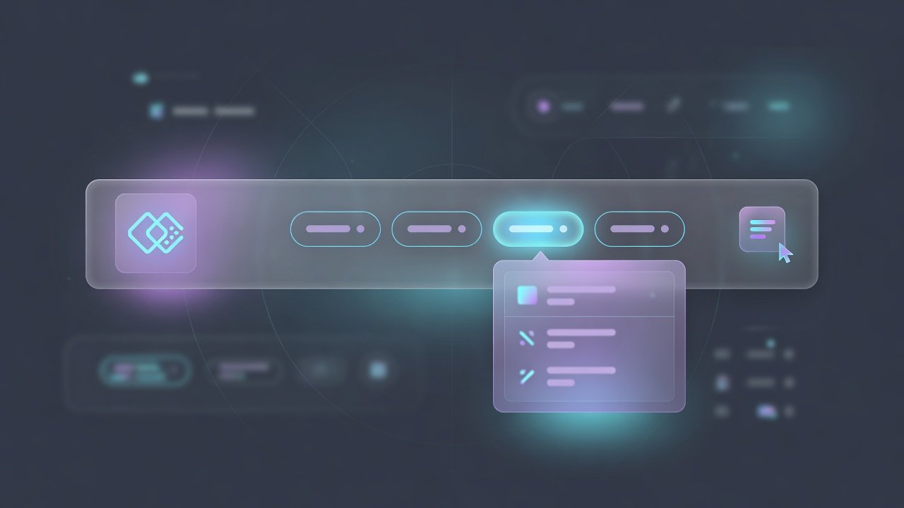
Group services or resources under one parent. Prefer :focus-within so keyboard users can open the panel. On touch devices, add a click toggle for production sites.
HTML
<nav class="nav-dd" aria-label="Main">
  <ul class="nav-dd__list">
    <li><a href="/">Home</a></li>
    <li class="nav-dd__item">
      <a href="/services/">Services <span aria-hidden="true">v</span></a>
      <div class="nav-dd__panel" role="group" aria-label="Services">
        <a href="/services/web-design/">
          <strong>Web design</strong>
          <span>Sites and landing pages</span>
        </a>
        <a href="/services/seo/">
          <strong>SEO</strong>
          <span>Structure and content</span>
        </a>
      </div>
    </li>
    <li><a href="/contact/">Contact</a></li>
  </ul>
</nav>
CSS
.nav-dd__list {
  display: flex;
  gap: 0.25rem;
  list-style: none;
  margin: 0;
  padding: 0;
}
.nav-dd__item { position: relative; }
.nav-dd__list > li > a {
  display: inline-flex;
  align-items: center;
  gap: 0.35rem;
  padding: 0.55rem 0.9rem;
  border-radius: 999px;
  color: #cbd5e1;
  text-decoration: none;
  font-weight: 700;
}
.nav-dd__panel {
  position: absolute;
  left: 0;
  top: calc(100% + 0.5rem);
  width: 16rem;
  padding: 0.5rem;
  border-radius: 1rem;
  background: #0f172a;
  border: 1px solid rgba(255, 255, 255, 0.12);
  box-shadow: 0 20px 50px rgba(0, 0, 0, 0.45);
  opacity: 0;
  visibility: hidden;
  transform: translateY(6px);
  transition: 0.2s ease;
}
.nav-dd__item:hover .nav-dd__panel,
.nav-dd__item:focus-within .nav-dd__panel {
  opacity: 1;
  visibility: visible;
  transform: none;
}
.nav-dd__panel a {
  display: grid;
  gap: 0.15rem;
  padding: 0.7rem 0.8rem;
  border-radius: 0.75rem;
  color: #e2e8f0;
  text-decoration: none;
}
.nav-dd__panel a:hover,
.nav-dd__panel a:focus-visible {
  background: rgba(255, 255, 255, 0.07);
  outline: none;
}
.nav-dd__panel span {
  color: #94a3b8;
  font-size: 0.85rem;
}
4. Mega menu
Wide multi-column panels for SaaS product areas, large blogs or store categories. Include short descriptions and one featured CTA card.
CSS (panel layout)
.nav-mega__item { position: static; }
.nav-mega__panel {
  position: absolute;
  left: 1rem;
  right: 1rem;
  top: calc(100% + 0.35rem);
  padding: 1.25rem;
  border-radius: 1.1rem;
  background: #0b1220;
  border: 1px solid rgba(255, 255, 255, 0.1);
  box-shadow: 0 24px 70px rgba(0, 0, 0, 0.5);
  opacity: 0;
  visibility: hidden;
  transition: 0.2s ease;
}
.nav-mega__item:hover .nav-mega__panel,
.nav-mega__item:focus-within .nav-mega__panel {
  opacity: 1;
  visibility: visible;
}
.nav-mega__grid {
  display: grid;
  grid-template-columns: 1fr 1fr minmax(12rem, 16rem);
  gap: 1.25rem;
}
@media (max-width: 900px) {
  .nav-mega__grid { grid-template-columns: 1fr; }
  .nav-mega__panel {
    position: static;
    opacity: 1;
    visibility: visible;
    box-shadow: none;
  }
}
5. Slide-in drawer
Common for e-commerce filters and app shells. Animate transform, not left, for smoother motion.
CSS
.nav-drawer__scrim {
  position: fixed;
  inset: 0;
  background: rgba(0, 0, 0, 0.45);
  opacity: 0;
  visibility: hidden;
  transition: 0.2s ease;
  z-index: 60;
}
.nav-drawer__panel {
  position: fixed;
  top: 0;
  bottom: 0;
  left: 0;
  width: min(20rem, 88vw);
  background: #0f172a;
  z-index: 70;
  transform: translateX(-100%);
  transition: transform 0.25s ease;
  padding: 1.25rem;
}
.nav-drawer.is-open .nav-drawer__scrim {
  opacity: 1;
  visibility: visible;
}
.nav-drawer.is-open .nav-drawer__panel {
  transform: none;
}
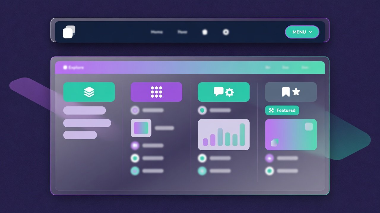
6. Glassmorphism header
Use blur and soft borders when the brand is energetic. Keep contrast high so links stay readable over hero photos. backdrop-filter needs a rich background behind the bar.
CSS
.nav-glass {
  display: flex;
  align-items: center;
  justify-content: space-between;
  margin: 1rem;
  padding: 0.75rem 1rem;
  border-radius: 1.25rem;
  background: rgba(15, 23, 42, 0.55);
  border: 1px solid rgba(255, 255, 255, 0.16);
  box-shadow: 0 18px 50px rgba(0, 0, 0, 0.3);
  backdrop-filter: blur(18px);
  -webkit-backdrop-filter: blur(18px);
}
7. Sidebar app navigation
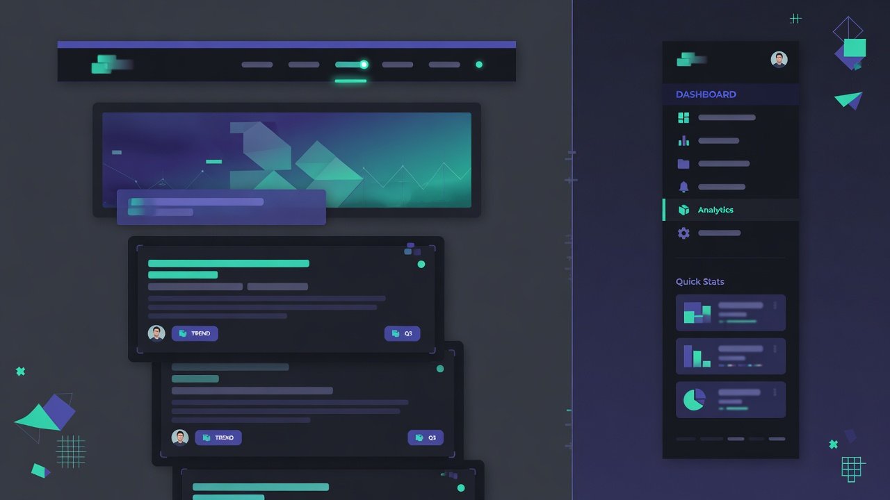
Dashboards and docs keep sections visible beside content. Collapse to icons on narrow widths or via a toggle.
CSS
.app {
  display: grid;
  grid-template-columns: 15rem 1fr;
  min-height: 100vh;
}
.app__side {
  background: #0b1220;
  color: #e2e8f0;
  padding: 1rem 0.75rem;
  border-right: 1px solid rgba(255, 255, 255, 0.06);
}
.app__side a {
  display: flex;
  align-items: center;
  gap: 0.65rem;
  padding: 0.65rem 0.75rem;
  border-radius: 0.65rem;
  color: #cbd5e1;
  text-decoration: none;
  font-weight: 600;
}
.app__side a.is-active,
.app__side a:hover {
  background: rgba(255, 255, 255, 0.06);
  color: #fff;
}
@media (max-width: 800px) {
  .app { grid-template-columns: 1fr; }
  .app__side { display: none; }
  .app.is-open .app__side {
    display: block;
    position: fixed;
    inset: 0 auto 0 0;
    width: 15rem;
    z-index: 40;
  }
}
8. Bottom mobile nav, tabs and breadcrumbs
Three secondary patterns you will reuse often:
- Bottom mobile bar — four or five primary destinations with
position: fixed; bottom: 0and page padding so content is not hidden - Tabs / pills — in-page section switching (pricing tiers, docs chapters), not site-wide routing
- Breadcrumbs — show hierarchy; mark the current page with
aria-current="page"and do not link it
Breadcrumb HTML
<nav class="crumbs" aria-label="Breadcrumb">
  <ol>
    <li><a href="/">Home</a></li>
    <li><a href="/blog/">Blog</a></li>
    <li aria-current="page">CSS navigation menus</li>
  </ol>
</nav>
Breadcrumb CSS
.crumbs ol {
  display: flex;
  flex-wrap: wrap;
  gap: 0.35rem;
  list-style: none;
  margin: 0;
  padding: 0;
  font-size: 0.9rem;
}
.crumbs li:not(:last-child)::after {
  content: "/";
  margin-left: 0.35rem;
  color: #94a3b8;
}
.crumbs a {
  color: #7dd3fc;
  text-decoration: none;
}
.crumbs [aria-current="page"] {
  color: #94a3b8;
  font-weight: 600;
}
Best practices checklist
- One primary CTA in the header — not three competing buttons
- Same information architecture on mobile and desktop
- Visible
:focus-visiblestyles; do not remove outlines without a replacement aria-expandedon toggles;aria-labelon icon-only buttons- Escape key closes open panels; return focus to the control that opened them
- Test at 320px, 768px and 1280px — and with a real thumb
- Prefer semantic HTML:
<header>,<nav>, lists for multi-item menus
Common mistakes
- Too many top-level items — force hierarchy with dropdowns or mega menus
- Hover-only menus on touch — add click toggles
- Tiny tap targets — pad links; avoid packing six icons into 40px height
- Low contrast glass — pretty blur is useless if text fails WCAG contrast
- Mega menu walls of links — group, describe, feature; do not dump the sitemap
- Sticky bar too tall — collapses content on short phones
- Different mobile IA — users lose pages that only exist in the desktop mega menu
Conclusion
Strong navigation is less about animation and more about hierarchy, clarity and responsive behaviour. Start with a clean responsive bar, add dropdowns only when the site outgrows a flat list, use mega menus for genuine breadth, and treat mobile as a first-class experience — not an afterthought hamburger.
Copy the snippets above, restyle with your brand tokens, and stress-test on a real phone. For a clickable playground of these patterns, open the CSS navigation menus demo.
Need a navigation system designed for your site?
I am Jamie Freeman — a UK web designer and developer. I build clear, accessible headers, mega menus and mobile drawers for business sites, and I can refactor a messy menu into something users (and search engines) can actually follow.
If your menu confuses clients or breaks on mobile: get a free quote.